Wednesday, 12 November 2008

File size and image quality changes D1)


VECTOR IMAGE

Vector images (.DXF) are angles, percentages basically using mathematics instead of pixels. This means that the file size of a vector image is a lot smaller than the file size of a jpeg image. Vector images keep there quality when resized because mathematics don’t change with larger sized images.
Below is an example of a vector image.
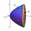


This image is saves as a Gif and you can see how the mathematics are used to create the image, and this is why it can be resized without the loss of quality of image. I am now going to justify the use of using a vector images for example they would be used in websites beacuse the vector images will speed up the download time and the quality of images when resized. But sometimes if the website are trying to sell a very desirable product they may want to use a higher quality image type to get the best quality picture.


JPEG IMAGE


As you can see above jpeg images are a lot more detailed when they haven’t been enlarged but when they have the quality becomes a lot worse quality. Jpeg images are much more detailed than vector images, but when resized most of the quality is lost.

There are compression techniques that will compress the file to make it as small as possible for example WinZip. When unzipped the image will be the same file size as it was originally and still have its original characteristics.
Image resolution is the overall detail level in the image; because DXF is a vector image the overall image detail is not as high as it would be if it was a jpeg. The colour depth of an image is the bits per pixel, the more bits in a pixel the more colours that are available more realistic. Vector images don’t use pixels so this doesn’t come into effect until the image is printed, and then its down to the printer defaults.
I am now going to justify what type of way a jpeg images will be used. For example jpeq images are high quality so will be used in glossy magazines beacuse the images are important in magazines and as long as they aren't resized the image will look of high quality.

The impact of evolving output media on the design and creation of graphic images D2)


The impact of evolving output media on the design and creation of graphic images can only be a good thing because it improves the quality of the final product. This evolving media makes the images a lot more clearer and life like. Output media needed to stay one step ahead because gaming was improving at a very high speed so the media had to keep up ready to cope with the next generation of game. But the quality of monitors weren’t as good quality as TV screens, monitors were improving only on things like screen size. Printer’s prices get a lot more expensive when you are looking for a top quality picture, the prices would jump massively for just a small improvement on picture but people will want the best picture possible of the image they have created. Printers have now been able to evolve into scanner, colour copier and a fax machine all in one. This is good if you use all these regularly but you may find that if you just use the printer you will pay a lot of money for a printer of average quality. The options to create the perfect graphic image through output media are endless but you will have to pay the price!
Other forms of evoulving output media are things such as web pages and mobile phones which are static images not moving images like video games and T.V. images. When creating images for web pages the designer will have to consider the output media when creating the images. For example size and image quality also the type of website needs to be taken into consideration if the website is a high quality website selling engagement ring etc the images will have to be of high quality. To tell the quality of a website you will need to look at the layout, design and image quality, websites also use videos alot more now and I imagine there will be a time when every website will have very high quality images beacuse PCs will become more powerful to deal with the images and speed up the download time.

Wednesday, 2 July 2008

M1
I am now going to compare two hardware devices that are utilised for the capture, manipulation and storage of graphics.

RAM
There are lots of different types of RAM below I have chosen two different types to compare.

The first RAM that I have chose to evaluate is the OCZ 2GB DDR3 PC3-10666C7 1333MHz Platinum (2x1GB) Dual Channel DDR3. This costs £117.49 Inc VAT.

The second RAM type I have chose to evaluate is the OCZ 2GB (2x1GB) PC2-6400C4 Dual Channel Platinum Revision 2 XTC Series DDR2. This costs £35.24 Inc VAT.

The first RAM is very good, but this type of RAM would be used by gamers who require more RAM for their games and the fastest RAM but this is not needed as much for Photoshop users. The second RAM is better for Photoshop users and it is relatively cheap so you can always add two more gig sticks.

I am also going to compare to different graphic card.

The first graphics card I am going to compare is the Onboard UniChrome PRO 3D Graphics with 64 MB shared memory

The second graphics card I am going to compare is the GeForce 8800 512MB GDDR3GT this costs £76.99

The first graphics card is ok but not good enough to display advanced graphics so I have decided to go with the GeForce 8800 GT 512MB GDDR3 because it is a lot better By improving the graphics card the systems ability to display better quality images increases which the first processor couldn’t do.

Thursday, 26 June 2008


File Format, Compression Techniques, Image Resolution and Colour Depth (M3)


I am now going to describe JPEG files and zip files

JPEG (Joint Pictures Expert Group) is a file format that is used to compress photographic images. JPEG is one of the most popular image format used by digital cameras and such. And is also popular with storing and transmitting images on the internet.


Zip files are single files it is most commonly used on windows operating systems. Zipping is the act of packaging a set of files into a single file or archive that is called a zip file. Usually, the files in a zip file are compressed so that they take up less space in storage or takes less time to send to someone. There are different tools used for zipping files for different operating systems for windows there are WinZip and Netzip, MacZip for Macintosh users and Zip and UnZip for UNIX systems. Have you have received a zip file, you may have to extract and decompress the file by using the same kind of tool that was used to zip the original file.


Image resolution
Image resolution describes the detail an image holds. The higher the resolution, the higher the detail in the image. Resolution determines how close lines can be to each other and still be visually resolved. Images are made up of lots of different colour pixels and if you zoom in to the picture you begin to see the pixels that are making up the picture. If you colour in individual pixels to make the quality better. Making the images bigger or smaller can also affect the quality of an image and this is the problem with manipulation of images.


I am now going to demonstrate the impact of zooming in on a image can have to the quality and file size of the image.


The file size of this image is 41.5 KB (42,553 bytes)


And the file size of this is 122 KB (125,201 bytes)


As you can see the further I zoom in on the image the worse the quality becomes and the file size becomes larger.

Colour depth
The number of possible colours in a graphic image, stored as a given number of bits per pixel. A colour depth of 8 bits provides 256 colours; 16 bits (also known as "High Colour") provides about 65,000 colours; 24 bits (also known as "True Colour") provides about 16,000,000 colours. The higher the colour depth gives a broader range of distinct colours.

Thursday, 19 June 2008

Legal Implications of graphics design P6
Graphics design can be quite a delicate matter when it comes to the law. There are various laws restricting what can and can not be done with other graphics that are on the internet but the laws can change from country to country. So it can be hard to understand and there are ways that people can steal other peoples work without breaking the law.

Copyright means the right to copy. So if somebody produces say a logo it is assumed that it is his/her own work in other words the person has the copyright to create the logo. So anyone else who would wish to use the logo would have to ask the person who created it or seek legal action. Action is manly only taken when there is money being made from someone else’s work. To gain permission to use some else’s work you would have to ask the person who created it. And the person would properly want a pay off for the use of there work this can range from hundreds to millions of pounds.

There are some designs that are copyright free this is basically when the user allows there work to be used freely to anyone. For example user made fonts. The creator will usually have some sort of text near or around the work to identify who the actual owner is. If they are not labelled this could mean they are copyright free or belong to the company or website.

Thursday, 22 May 2008

P3 and p5) Summary


I am now going to define and document a client and user needs for three related graphic images. The client is a family that owns a chain of local shops. The users are existing and potential customers of the shops. The images I need to create are-

A map showing the location of the shops owned by the family to be used for a website and brochure.


A new logo for the chain of shops.


A poster to display in the shops using the logo and selection of photographs of products sold by the shops.


The map showing the location of the shops

This map will show the location of all the shops that the family owns and where they are situated. The target audience would be the potential customers. The map will need to be easy to understand and be large so that potential customers can notice it. The time it will take me to complete this map would be about half a hour and the file size is 3.76 MB I would also like the logo that I have created to be the marker of each of the restaurants located on the map. I will scan in a picture of a map and edit it in PhotoShop. The map will be used for the webpage and for the brochure and will need to be printed. Plus the house colours of blue, white and green will be situated on the map.


The new logo for the food chain

The new logo will need to look professional and have the house colours which will be blue, white and green it will catch the eye of passers by and be simple so customers can recognise it the size of the logo will vary but the one that I am going to make will be 6 inches by 6 inches. The timescale of this logo will also be around an hour and this logo will need to be printed and will also be used on the web pages. The file size of this logo is 364 KB. I took a picture of the trading post logo at leek collage using a digital camera, and edited it on Photoshop.


Poster to display in the shops

The poster will be used to put in all the shops and will show offers that are available it will have to be large about 3ft width and 6ft height. It will have the logo that I have created on the top left hand side of the screen. The colours will be blue, white and green (house colours) the time period for this poster would take me about an hour. And this poster will also include a selection of photographs of food that is sold by the shops. This poster will be printed. The file size of this poster will be 797 KB. This chain sells orgainc food so the poster will have to appeal to the customers and say somthing about the orgainic food they have to offer.


Thursday, 8 May 2008

(Towards P4)


Microsoft specification

Microsoft has approached Visual Impact to produce some displays for its stand at a show to be held in the Birmingham NEC publicising its newest operating system. Produce a graphic that could be printed onto a large piece of card to be used on the Microsoft stand. So the graphic I am going to produce is a large graphic that will be put on the wall the specification for this will


Catch the eye of passers by

The colours will be in scope with the original log

Also have to look professional

Also has to look like a banner so the width and height must be correct.

Summary

I think I have acheived all of my design needs, it catches the eye of passers by, the colours are in context with the orginal logo, it looks profesional and the width and height settings make it look like a banner.


EnCert specification

EnCert is a new company providing Energy Certificates to homeowners. They require a logo for their website and letterheads. EnCert needs the logo to look professional and make the clients to associate it with energy (gas, electricity, enviorment etc). So I am going to create a logo that must.

Note
The logo is for people with four bedroom houses (so these people may have more money)

Be easy on the eye and easy to remember

Consider colours to use for example green, blue, red etc.

Has to look professional.

1st design


This is the first time I have used PhotoShop and this first design is obviously not good enough as it doesn't look profesional so I had to create a new design.


2nd design

This in my opinion is alot better as it looks more profesional.


Summary

I am very happy with my logo beacuse it meets all the critera its easy to remeber, looks professional and the colours are in context green and blue.


Burger and food bar road sign

An organics foods mobile fast-food service has requested a roadside sign. It will be used on a stand so when its van is parked in a lay-by offering quality burgers passing motorists will notice it.


Must catch the eye of passers by

Bright colours to do with food

Must entice customers by showing food


Have a logo of the company in the top left hand side of the screen


Summary

Again I think I have created a good sign to entise customers into the burger bar it catches the eye of passers by, shows food to entise the customers, and I have created a logo and put it on the left hand side of the screen I have created a logo so I the burger bar decides to create new stalls the customers may reconise the logo and go to the stall again. I have also added bright colours to do with food (apart from the white writting which iI choose beacuse it stands out more than other colours on this background).